Teaching a design system to work with AI
Made Slingshot's design system AI-ready — 800+ tokens across four tiers, mapped between Figma and code and written down precisely enough that a tool can build from it. A new screen now starts at 70% built instead of 25%, so standing one up takes a day or two instead of a week.
Context
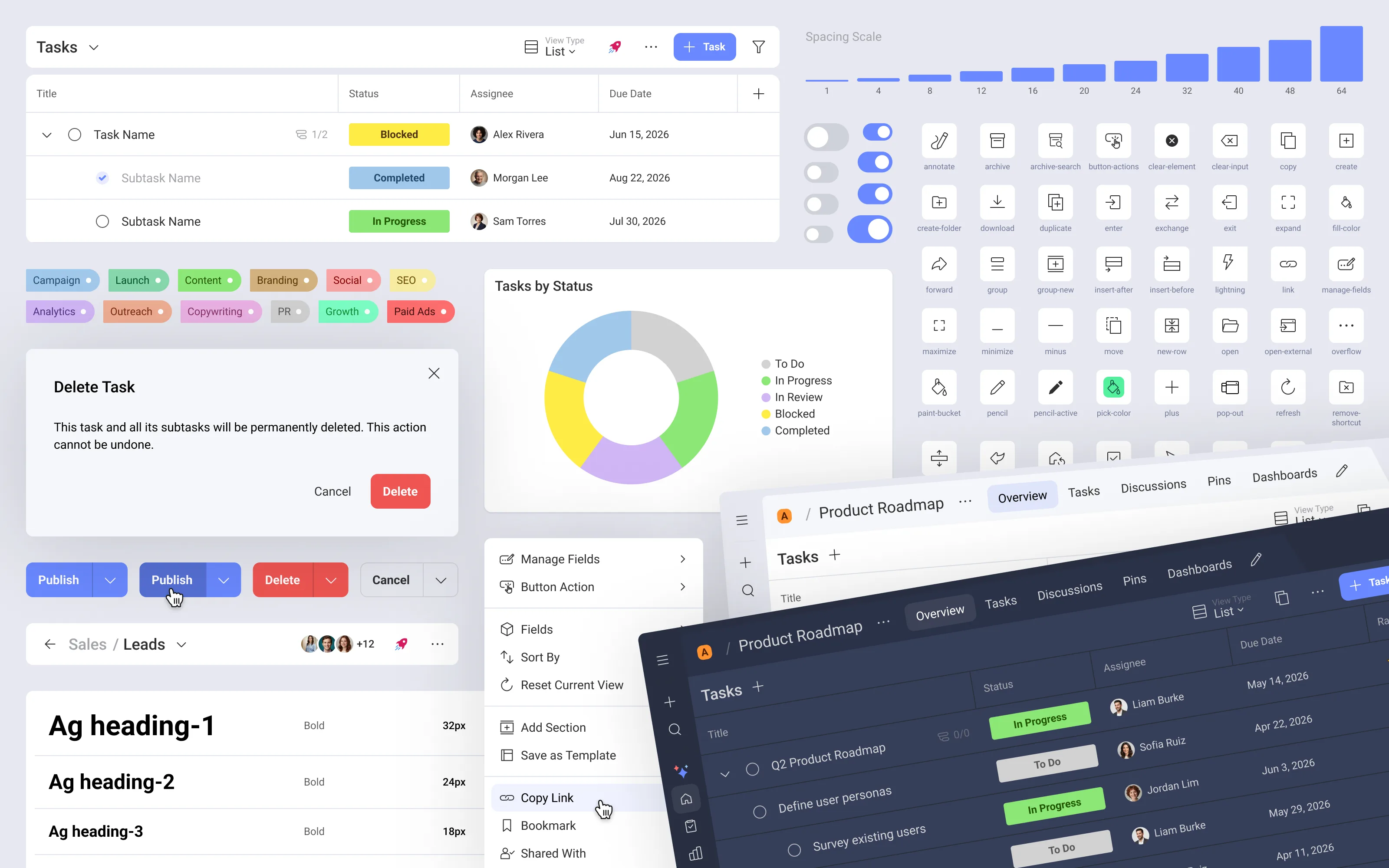
Slingshot is Infragistics’ enterprise work-management platform, built on a large design system in a proprietary UI framework and in Figma.
I had just started when I saw what my teammates’ workflow was: asking each other which was the latest version of the tasks screen, or of the People Picker component. The answer was a link to a Figma file for a feature.
I tried to work off the components in the library and it was chaos. Half of it wasn’t up to date, it didn’t work. A lot had been brought over from Sketch to Figma directly, with no testing and no review. It was a system that was basically dead: the icons were being used, and at most six to eight components. Nothing more than that.
I put an artboard on the table and saw that everything was disconnected. That nothing was a component.
And the team was starting to write code with AI. A system a new person couldn’t read wasn’t going to be readable by a machine either.
My role
I owned the system’s AI-readiness end to end — token architecture, the design↔code mapping, the shared vocabulary, and the rules for what an AI may and may not do. Those rules became the contract the design team worked to every day, and the one anything building from the system had to meet. My counterpart was the product owner.
Research & insight
I watched where things broke:
- Design and code had drifted apart. One button, hundreds of Figma variants, no authoritative map to its code props — so everyone guessed.
- Tokens existed; the rules didn’t. No guidance on which tier to use, so raw values crept in.
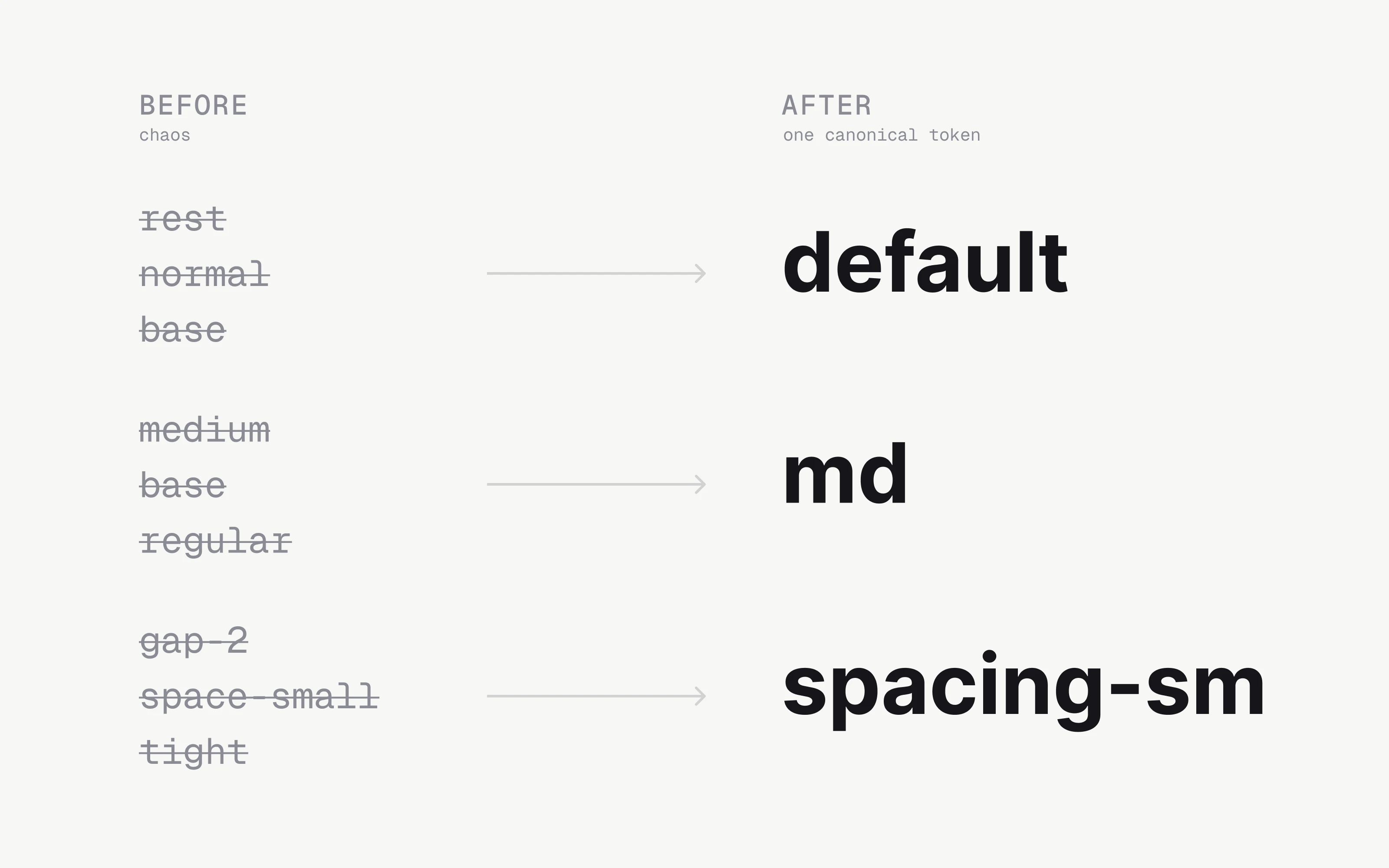
- The vocabulary had drifted. One idea, many names (“rest” vs. “default”).
- Context lived in people’s heads — every new collaborator started from zero.
The insight: an AI isn’t sloppy because it’s dumb, but because the system never told it the truth. Give it the same clear contract you’d give a new teammate, and it behaves like one.
What I did
The first thing I tried was fitting into their workflow, and I couldn’t — it was stronger than me. So in parallel, every time I was working on a specific feature, I generated the components and quietly updated the design system a bit at a time. If I have to use a list item, I go, I find it, I bring it over, I see what’s wrong with it, and I fix it. Then it’s fixed, and I start using it.
It worked for me. Not so much for my teammates. Even though I passed the updates along every so often, they were already attached to their workflow: copy and paste disconnected things. Growing it a bit at a time wasn’t worth it to them, because they had to change little pieces and little components. There was no such thing as one pass and done.
I was working on the design system alone: I made a new Figma file from scratch and started generating the new components there. Because it was work in progress the whole time, it wasn’t practical for my teammates to pick it up at that point.
Every time I had to work on a feature — one in the tasks section, say — I built all of it with components from the new design system, and added what I needed as I went. Not just components: molecules and templates too.
It was an under-construction design system. I was the only one using it, until it got mature enough for my teammates to start using it — and to start using it with AI tools. That’s when we moved to 70%.
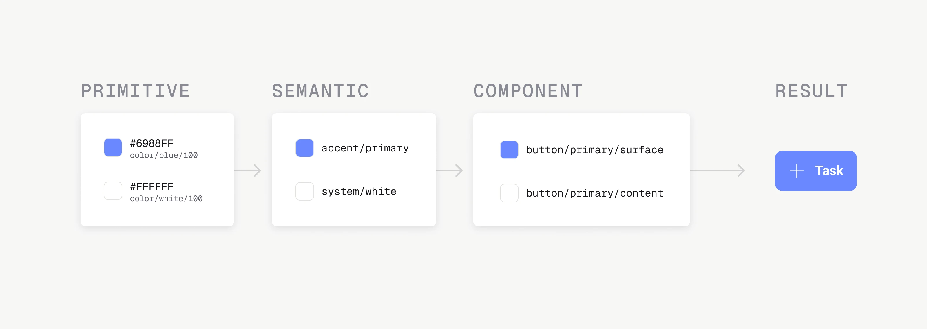
Gave the tokens a backbone. ~800 tokens in a four-tier chain, one rule per tier, with light/dark as a mode on the semantic layer — a right answer for every value.
Set one vocabulary. Kebab-case, one size scale, one name per concept across Figma and code.
Left screen-level components out. A screen-level component in Figma means everything is configurable from the sidebar and you can’t build on top of it — and Figma slots didn’t exist yet, which made it more limiting still. What I proposed was one level less of componentisation: the navigation, the fixed UI, the shell, the title bar, the toolbar — a whole fixed casing wired to components — and then a content area left empty, to build from there.
Wrote the context down. The rules live as version-controlled docs a tool loads fresh each session — change a rule, the next build follows it.
The AI proposes, the designer approves
Making a system legible to a machine forces you to state exactly what it decides and what it doesn’t:
- Plan before build — the tool proposes an approach and the shape gets approved before any code exists. Redirecting an outline is cheaper than redirecting a diff.
- Never invent — when something is missing it stops and asks instead of filling the gap with a plausible guess. A system that guesses stops being a source of truth.
- The structural calls are design work — new component vs. compose an existing one, which pattern replaces which, how the tiers are shaped. Those set what everything downstream inherits, which is why they sit with the designer.
Outcome
The system became something an AI could build from and a person could trust. By the end, all of us started a new feature with 70% of the work it used to take us already done — on-token and on-brand, instead of the 25% of a half-wired file with every real decision still to make. In practice that turned standing up a new screen from about a week into a day or two. The designer’s time goes to the last 30%: the polish that decides whether it’s actually good.
The gain wasn’t only speed. Writing the rules down precisely enough for a machine to follow made them precise enough for new people to follow too.
That’s the model I believe in — not automation that replaces the designer, but a system explicit enough that anything building from it lands in the same place, and the designer’s attention goes where judgment actually pays.
Working on something similar? I’d like to hear about it.